Searching for the best way to get new users interested in your product or service? A call-to-action, or CTA, inspires your reader to act. CTA’s give the reader clear direction on what to do next and concise reasoning on why they should do so. A clean, easy-to-spot CTA can generate up to 232% more conversions.
In this article, we’ll discuss everything you need to know about call-to-actions. We’ll break down exactly what a CTA is, where to include a CTA on your website, what to avoid with CTA’s, and even some real-life call-to-action examples!
What is a Call-to-Action?

A call-to-action, or CTA, is designed to grab the attention of new or returning users and guide them directly (and concisely) to why or how your business can help them. An effective CTA provokes emotion or enthusiasm to excite the reader about your business.
Most CTA’s use FOMO (the fear of missing out) to convince readers they will miss out on an opportunity if they don’t take a desired action, like buying a product or signing up for a newsletter.
When a customer clicks on a CTA, they arrive at a landing page where they can make a purchase, subscribe to your newsletter, or make an inquiry. Typically, CTA’s appear as a pop-up box, banner, or button on a website.
5 Ways to Include a Call-to-Action on Your Website
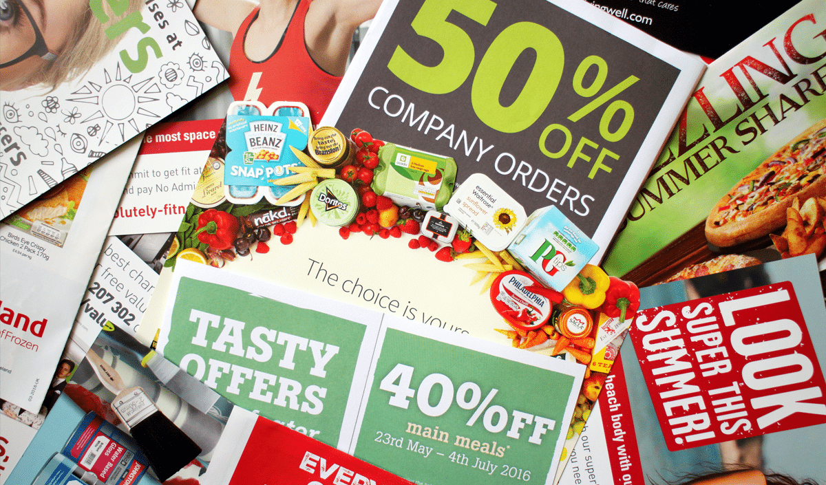
To capture your reader’s attention, your CTA must stand out visually. There are a plethora of call-to-action examples to feature on your website, including:
- Above the fold – Adding a CTA before they scroll down your main page helps guide the reader quickly. However, with this method, it can be more difficult to give readers a reason why they should look further into your content.
- Below the fold – This option gives the reader time to review your content and encourages them to proceed. If this is the only CTA you use, your reader may experience information overload.
- Inline CTA’s – These CTA’s are sprinkled within your text so the reader can find relevant content before you ask for any type of follow-up action. Since these CTA’s flow within your text, they don’t intrude on the information you give the reader.
- Pop-up CTA’s – These CTA’s are clear, concise, and require action before the reader can move elsewhere onto your site, guaranteeing they see your CTA and engage with your content. A main disadvantage of these, though, is that if they are done incorrectly, they can be intrusive and annoying.
- Sidebar CTA’s – With this option, readers can view content and follow through on a CTA simultaneously. Visually, they are not as appealing as other CTA’s and can distract the user.
Using any of the call-to-actions listed above can increase your business’s conversion rates, but it is most effective to combine them in a way that compliments your website. In fact, recent research has found that conversion rates increased up to 20% with multiple CTA’s in addition to the main link.
It’s important to include CTA’s throughout your website. That way, when new users view your page, they immediately get a feel for your business and how it benefits them. Once the reader explores your brand, they don’t have to hunt down the original link, and they can easily follow through with contacting you. Ease of use is key.
What to Avoid with Your Call-to-Action
The way you phrase your call-to-action is very important. When you write your CTA, be sure to avoid:
- Long sign-up forms – Avoid any phrase that implies the user has to provide information before they receive something in return.
- Boring or lackluster wording – Omitting a sense of urgency or leaving out the value of your proposition may give readers a sense of what your business can do but no reason why they should use you.
- Too many call-to-actions – Multiple CTA’s can confuse and overwhelm the reader. Focus on one business goal and build your CTA off of that.
- Too many graphics – Crowding your CTA with too many visuals can have the same effect as too many options. If the reader cannot find your CTA, it does not help your goal.
4 Real-Life Call-to-Action Examples
There are endless ways to build call-to-actions and include them on your website. A killer CTA is short, informative, and creates a sense of urgency for the user. Here are some of our favorite call-to-action examples:
1. Peloton

Peloton is a fitness company that offers high-end exercise equipment, including bikes, treadmills, and rowing machines. Also, they have an app with thousands of classes (and you don’t have to own a Peloton machine to own or buy the app).
There is a free version of the Peloton app with limited class options. However, users can try the $12.99 paid version for 30 days, completely free of charge. This CTA encourages users to join for free but also explains the different membership options below.
2. Chipotle

A good CTA tells you exactly what to do. Chipotle uses a compelling headline and animated images to promote their product, and they encourage users to take action with a red CTA button that reads “Order Now.”
3. Target

This call-to-action on the Target website promotes the current back-to-school shopping season, as well as relevant discounts. The red CTA button is front and center for “ready for school” shoppers.
4. Vidyard

Vidyard is a video platform for businesses to record and send sales videos easily. Currently, they offer two call-to-actions on their website. Users can either sign up for free, or they can schedule a 15-minute demo to learn more about Vidyard. The “sign up for free” option is in a darker color which guides the viewer to this option first.
Boost Conversions and Sales with a Killer Call-to-Action
Feeling inspired by these call-to-action examples? Call-to-actions stand out from the rest of your content in many ways. They give new users a quick, concise view of what your business can do for them and why they benefit from your products and services.
From there, you can create a CTA, either with a concise phrase or with a short sentence that explains the benefit of your product or service. That being said, remember to regularly test your CTA’s to see what works best for your audience, and don’t be afraid to experiment with different options. Luckily, Envision by Design is here to help!
Captivate and Engage Readers with Envision By Design
At Envision by Design, we create responsive, visually-appealing websites to help you increase awareness, showcase your products and services, and increase leads. Want to learn more about our website services? Contact Envision by Design today!